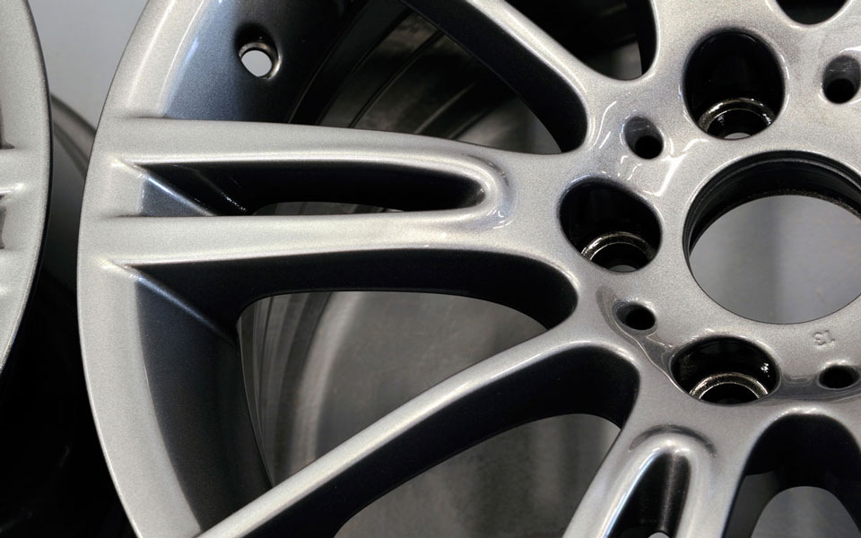


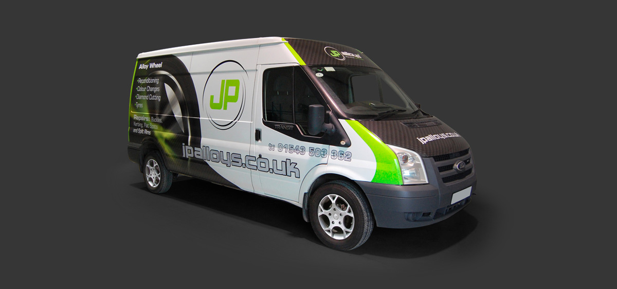
We used a bold, lime green and black colour scheme to ensure that the logo stands out in any environment whilst the circular icon not only refers to the wheel market but also creates a dynamic element. The final flourish is the addition of the arrowhead shape which links the company to the Bowman Group.
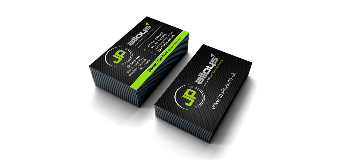
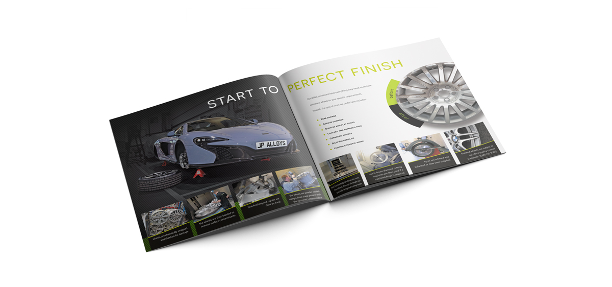
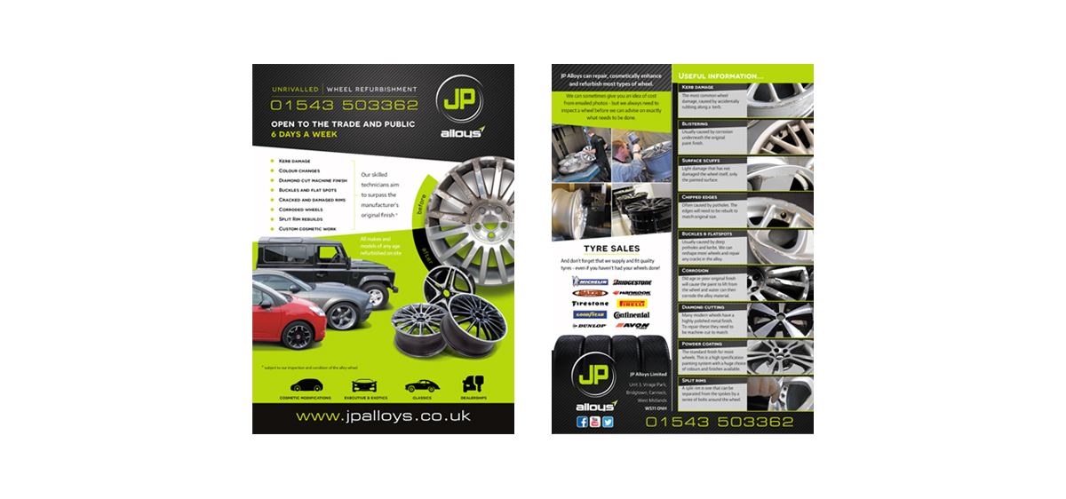
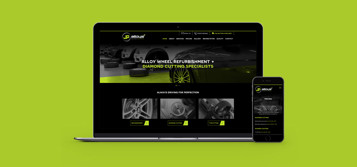
In order to create the maximum impact for the launch, Charles Design was commissioned to produce a variety of marketing devices including printed literature, website, stationery, corporate presentation, and signage.
The company vehicle is an important mobile advert for JP Alloys and we were happy to be able to create the look of the van, incorporating the key graphic elements.
We are pleased to be involved with JP Alloys’ ongoing marketing requirements which have included projects such as e-shot creation and the design of large scale advertising hoardings.